Genocide-Enablers Cracker Barrel Updates Logo After 50 Years
"The Ink is on their hands."

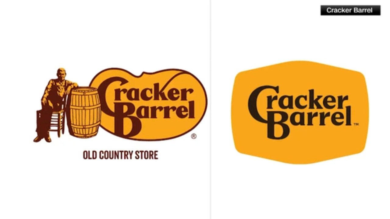
LEBANON, TN— In what experts are calling “the Cambodian Killing Fields of Typography,” Cracker Barrel unveiled its first new logo in half a century Wednesday, scrubbing the majority of the seriffed letters from its brand in what human rights monitors described as a “clear act of typographic genocide.”
“First, Microsoft Word came for Times New Roman, and I did nothing,” declared Dr. Laura Pritchard, professor of Semiotics at UCLA, gesturing to the smooth, limbless wordmark. “Make no mistake—this is a pogrom. Every spur, foot, and hook has been cleansed. This isn’t a design choice. This is the Final Solution to the Serif Question.”
"Is anyone surprised members of the Arial Nation and Neo-Sans Nazis consider the Cracker Barrel Purge a victory?" said historian Beth Johnson. "Anti-Seriffism started with the Third Reich's purge of Gothic font. It’s a well-known fact that Hitler loved Futura."
Investigators with Amnesty International Design Division released photographs of unmarked mass graves discovered in Cracker Barrel storage units—mugs, menus, and signage littered with the broken bones of serif glyphs, their delicate ornaments hacked off and dumped in cardboard boxes. “We counted dozens of capital Rs and Es,” one investigator whispered, choking back tears. “All because they looked too ‘old-timey.’”
Critics noted that the new design retains faint serifs on the capital C and B of the logo, which many see as a calculated attempt to dodge international accountability. “It’s a classic genocide-denial tactic,” explained Johnson. “Leave behind a token serif, and you can claim it was never a total erasure. But we know what happened here.”
Other victims are struggling with the day-to-day fallout. “They mutilated the letters so badly I can’t even tell an ‘I’ from a lowercase ‘l’ or the number ‘1,’” said local woman Heather Marsh, holding a faded Cracker Barrel menu as evidence. “Seriffs were here. They called this place home. You can’t erase the past.”
At press time, Cracker Barrel executives defended the redesign, claiming it was simply an attempt to make the brand more “accessible to younger audiences.”
The Hague has already announced preliminary hearings into what it is calling “the largest crimes against typography since Comic Sans.” Prosecutors are reportedly preparing cases against Cracker Barrel, Google, Spotify, and Airbnb for “systematic anti-seriff campaigns” carried out under the guise of modernization.
Sources say serif fonts Courier, Cambria, and Georgia have been subpoenaed as witnesses to atrocities.
I really look forward to your posts. Thank you for another laugh. 🦋💚